 Miya Bholat
Apr 17, 2026
How to Use Data Visualization Tools as a Truck Driver?
Key Takeaways
- Truck drivers can use dashboards to track fuel trends.
Visual charts make it easier to spot inefficiencies before they become expensive problems. - Data visualization turns raw logs into actionable insights.
Instead of guessing, drivers can rely on patterns and trends. - Simple charts help improve driving and maintenance habits.
Small changes based on data can reduce fuel waste and downtime. - Modern fleet tools automate data visualization.
No spreadsheets or manual work required for drivers. - Starting with one metric (like MPG) builds confidence.
Drivers can gradually expand into maintenance and route optimization.
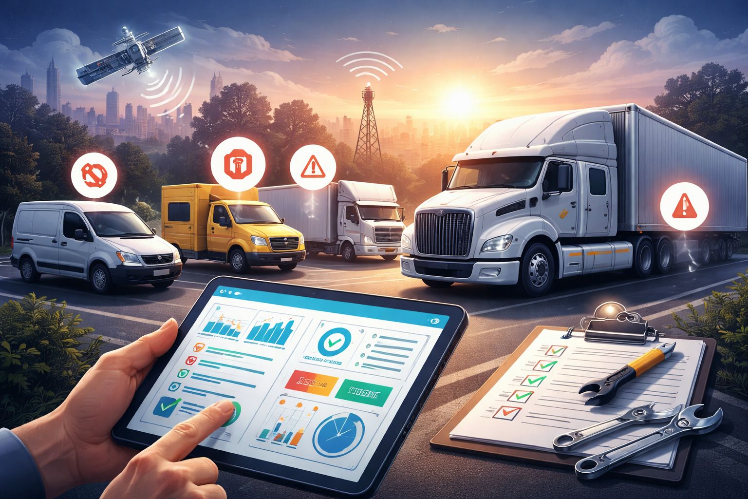
Why Data Visualization Matters Behind the Wheel
Most truck drivers deal with data every day like fuel receipts, mileage logs, inspection reports but rarely see the bigger picture.
Numbers alone don't tell a story. A fuel receipt tells you what you spent today, but it doesn't show whether your fuel efficiency is improving or getting worse over time.
That's where data visualization changes everything.
Instead of looking at scattered data, drivers can see patterns:
- A steady drop in MPG over weeks
- Increased idle time on certain routes
- Maintenance issues happening more frequently
Even fleets already using tools like fleet management software can miss insights if the data isn't visualized clearly.
When data becomes visual, it becomes usable even while you're behind the wheel.
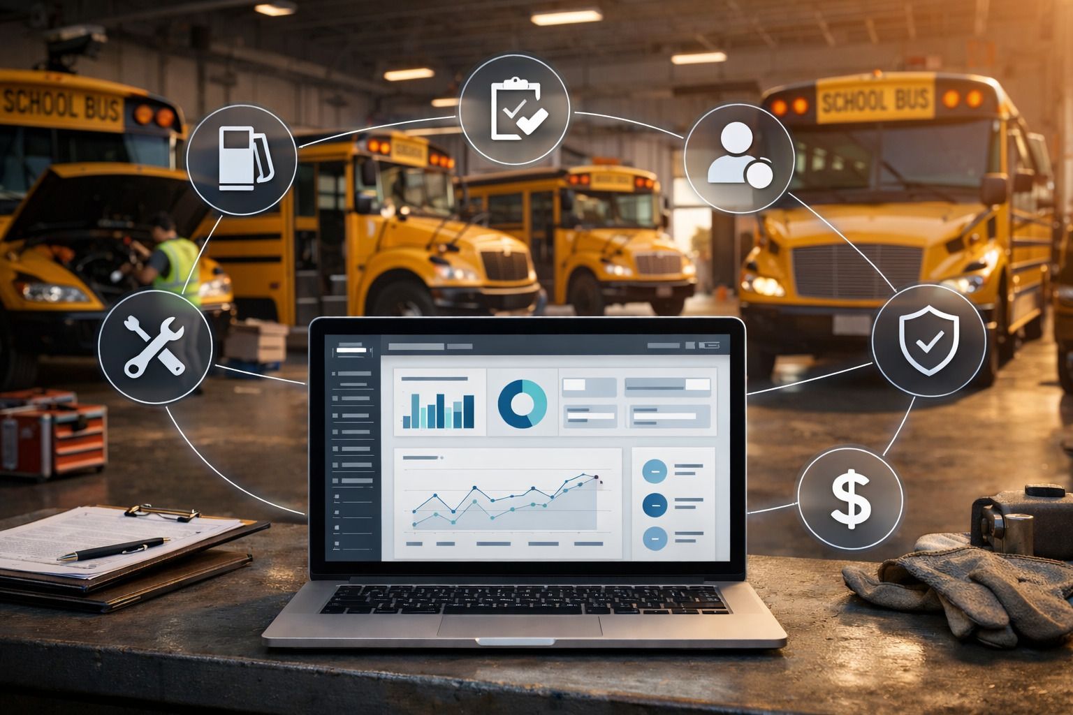
The Types of Data Truck Drivers Generate Every Day
Truck drivers generate more operational data than they realize. The key is understanding what matters and how it connects.
Fuel and MPG Data
Fuel data is one of the most important performance indicators for drivers.
Instead of looking at one fill-up, trends matter more:
- MPG over time
- Fuel cost per mile
- Fuel usage across routes
Using tools like fleet fuel management software helps convert fuel logs into charts that highlight inefficiencies instantly.
Mileage and Route Data
Every trip creates valuable data:
- Distance traveled
- Route efficiency
- Idle time
- Stop frequency
With solutions like trip mileage tracking, drivers can compare routes visually and identify which ones waste time or fuel.
Vehicle Health and Maintenance Data
Inspections, fault codes, and service logs generate critical data for performance and safety.
Instead of reacting to breakdowns, visualizing:
- Maintenance frequency
- Recurring issues
- Service intervals
Tools like a digital vehicle inspection app and vehicle service history make this data easy to track and understand.
What Data Visualization Tools Actually Do (In Plain Terms)
Data visualization sounds complex, but it's actually simple.
Think of it like this:
A gas gauge tells you how much fuel you have right now.A fuel efficiency chart tells you how your driving habits affect fuel over time.
That's the difference.
Here's what visualization tools typically show:
- Line charts → trends over time (like MPG)
- Bar charts → comparisons (routes vs fuel cost)
- Dashboards → everything in one place
- Alerts → when something goes wrong
Instead of digging through logs or spreadsheets, everything becomes visual and instant.
This is especially important if you're moving away from manual tracking methods like spreadsheets vs fleet management software where insights are easy to extract.
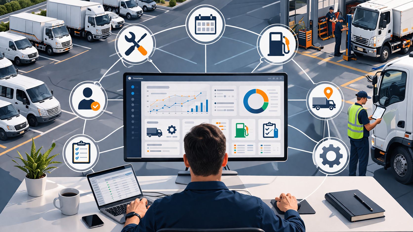
How Truck Drivers Can Use Dashboards to Improve Performance
Dashboards aren't just for managers, drivers can use them daily to improve performance.
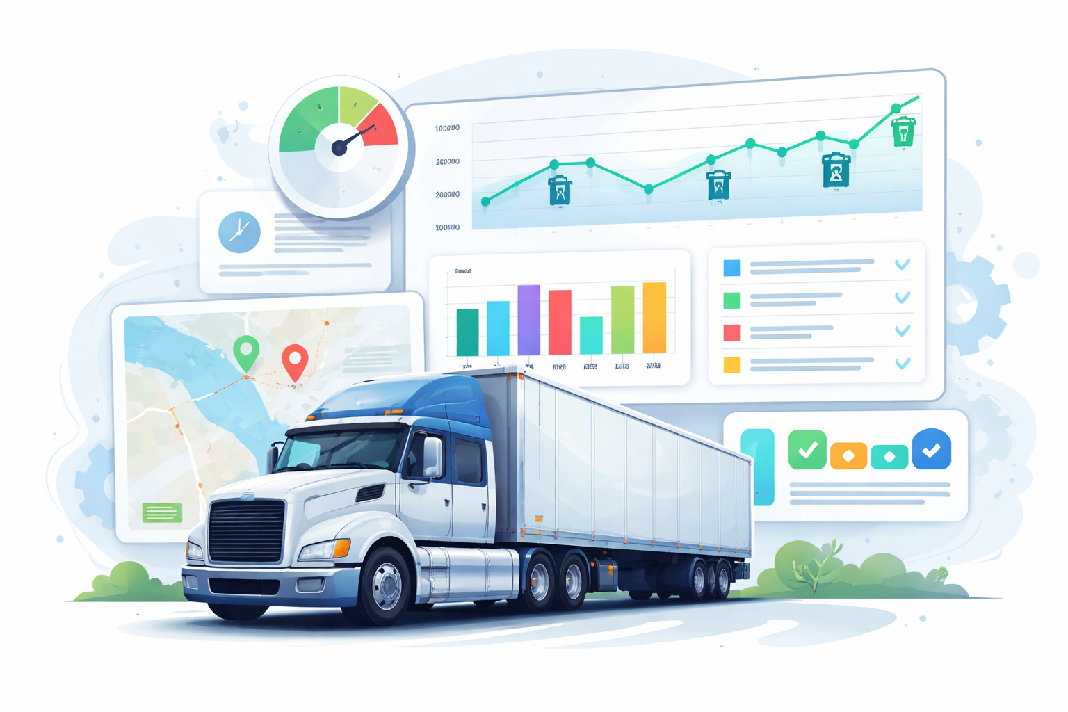
Tracking Fuel Efficiency Over Time
A simple line chart can show whether your MPG is improving or dropping.
For example:
- If MPG drops from 7.5 to 6.8 over two weeks
- It could signal tire pressure issues, heavy loads, or excessive idling
Small improvements matter.
A 1 MPG improvement across a fleet running 100,000 miles/year can save thousands in fuel costs.
Monitoring Maintenance Schedules Visually
Instead of remembering service dates, visual timelines make it obvious:
- Green → up to date
- Yellow → upcoming service
- Red → overdue
Using tools like fleet preventive maintenance schedules helps drivers stay ahead of breakdowns instead of reacting to them.
Comparing Trip Performance Across Routes
Drivers can compare routes using visual data:
- Fuel cost per route
- Time taken
- Distance vs efficiency
With insights from information fleet manager track daily, weekly and monthly, drivers can understand what actually impacts performance.
Choosing the Right Data Visualization Tool for Your Fleet Role
Not all tools are built for drivers.
Some are too complex, while others are too manual.
Here's how they compare:
- Enterprise BI tools — powerful but too technical for daily driver use
- Spreadsheet charts — flexible but time-consuming and manual
- Fleet software dashboards — automated, simple, and driver-friendly
When choosing a tool, look for:
- Mobile access
- Automatic data syncing
- Simple dashboards (no training needed)
- Real-time updates
Many fleets struggle when tools don't match their workflow, as explained in why fleet management systems break in operations.
Common Mistakes Drivers and Fleets Make with Data
Even with the right tools, mistakes happen.
Here are the most common ones:
- Tracking data but never reviewing it
- Looking at too many metrics at once
- Ignoring trends and focusing only on daily numbers
- Not connecting data insights to real driving behavior
- Relying on manual processes instead of automation
These issues often come up in common fleet management mistakes, especially when data isn't used effectively.
How Fleet Tools Turn Data Into Action (Without Extra Work)
Collecting data is one thing. Actually, using it is where most drivers and fleets struggle.
The problem isn't a lack of data, it's that the data is scattered across fuel logs, inspection sheets, and maintenance records. When everything lives in different places, it becomes hard to connect the dots.
That's why many fleets move away from manual systems or disconnected tools and start using platforms that bring everything together. Instead of switching between apps or paperwork, drivers can see fuel trends, maintenance status, and trip data in one place.
For example, when inspection data from a digital vehicle inspection app feed directly into maintenance schedules, it becomes much easier to spot patterns early. A recurring issue doesn't just sit in a report, it shows up as a trend you can act on.
The same applies to fuel tracking. When fuel logs are automatically visualized through tools like fleet fuel management software, drivers don't need to calculate anything manually. They can quickly see if their MPG is dropping and adjust their driving habits accordingly.
Maintenance becomes more predictable too. Instead of reacting to breakdowns, structured systems like fleet preventive schedules help drivers and managers stay ahead by making service timelines visible.
What makes the biggest difference is not just tracking data, it's connecting it.
That's the idea behind modern fleet systems, where everything from trip logs to service history feeds into a single dashboard. As explained in how integrated fleet management software connects your entire operation, this kind of setup removes guesswork and helps both drivers and managers make faster, more informed decisions.
In the end, the goal isn't to use more tools. It's to make the tools you use actually work together.
Getting Started: A Simple Framework for Drivers New to Data Visualization
If you're new to data visualization, don't overcomplicate it.
Start simple and build gradually.
Here's a practical approach:
- Start with one metric (fuel or MPG)
- Use a tool that visualizes it automatically
- Review trends weekly, not daily
- Identify one improvement at a time
- Expand to maintenance and route data later
Many fleets fail because they try to do everything at once, which is why resources like emphasize starting with structured systems and scaling gradually.
The goal isn't to track more data, it's to make better decisions with the data you already have.
Frequently Asked Questions
-
Can truck drivers use data visualization tools without technical skills?
Yes. Modern fleet tools are designed with simple dashboards that automatically display data. Drivers don't need to create charts manually, they just review what's already visualized. -
What is the most important data for truck drivers to track?
Fuel efficiency (MPG) is one of the most important metrics because it directly impacts costs. Maintenance schedules and route efficiency are also key for reducing downtime. -
How often should drivers review their data?
Weekly reviews are ideal. Daily data can be noisy, but weekly trends help drivers identify patterns and make meaningful improvements. -
Do drivers need separate tools for visualization?
No. Most modern fleet platforms include built-in dashboards. Tools that combine tracking and visualization are more efficient than using separate systems. -
How does data visualization improve driver performance?
It helps drivers see patterns in fuel usage, maintenance needs, and route efficiency. With clear insights, they can adjust habits and avoid costly issues before they happen.