 Miya Bholat
Feb 20, 2026
Fleet Data Visualization: How Dashboards Turn Fleet Data Into Operational Decisions

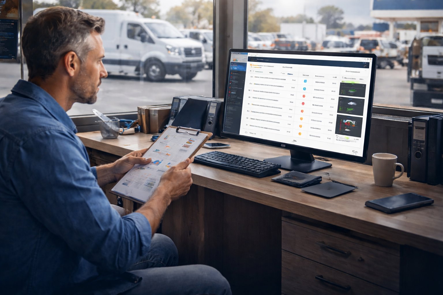
Fleet data visualization is the practice of converting raw fleet data (GPS coordinates, fuel transactions, maintenance records, inspection results, and driver behavior events) into visual formats (dashboards, charts, trend lines, and heat maps) that reveal patterns a spreadsheet cannot show. The distinction matters because most fleet managers already collect the data. The gap is between having data and using data. A spreadsheet with 10,000 fuel transactions tells you nothing at a glance. A dashboard showing cost-per-mile trend by vehicle over 12 months tells you exactly which vehicles are getting more expensive and how fast. Fleet data visualization is a core function of fleet performance management because the decisions it enables (replacement timing, route adjustment, driver coaching, PM compliance improvement) are the same decisions the performance pillar measures.
This guide covers the specific metrics a fleet dashboard should display, the trade-offs between simple and advanced dashboard design, how to avoid dashboard fatigue (the phenomenon where too many metrics with equal visual weight cause managers to stop looking), and how to connect dashboard visibility to operational decisions that reduce costs.
Key Takeaways
- Data volume does not equal insight. Fleets often collect massive data but fail to visualize it in a way that supports fast decisions.
- Dashboards must prioritize action-driving metrics. Utilization, maintenance compliance, MTBF, and cost per mile reveal operational health quickly.
- Visualization enables predictive maintenance. Early pattern detection prevents costly breakdowns and service disruptions.
- Tool selection should emphasize usability and integration. A simple, well-adopted dashboard outperforms a complex, unused one.
- Decision-first design ensures long-term value. Dashboards should reflect real operational choices, not just available numbers.
Why Fleet Managers Are Drowning in Data (But Starving for Insight)
Modern fleets generate more data than ever before. Every vehicle trip, fuel transaction, maintenance record, driver inspection, and telematics ping adds another row to an ever-growing spreadsheet. On paper, this looks like progress. In reality, it often creates the opposite effect: information overload without clarity.
Many fleet managers face a daily contradiction. They have thousands of data points but still struggle to answer simple operational questions like:
- Which vehicles cost the most to maintain?
- Are preventive services happening on time?
- Where is fuel spending quietly increasing?
- Which assets are at risk of breakdown?
When data lives in disconnected tools (spreadsheets for fuel, paper logs for inspections, separate software for GPS, and email threads for maintenance), patterns stay hidden. Decisions then rely on memory or intuition instead of evidence. That gap between having data and using data is where fleets lose money, safety margins, and uptime.
Fleet data visualization closes this gap. Instead of forcing managers to hunt for numbers, dashboards bring the most important signals forward instantly.
What Fleet Data Visualization Actually Means
Beyond Bar Charts and Pie Graphs
Fleet data visualization is not about decorating reports with colorful graphs. In a fleet context, visualization means turning raw operational inputs into a real-time command center that answers "What needs attention right now?" rather than "What happened last quarter?"
Static reports look backward. They help with audits and historical reviews, but they rarely prevent problems. Dynamic dashboards, on the other hand, show live conditions such as overdue maintenance, rising fuel costs, and compliance gaps. This helps managers act before the consequences escalate.
A well-designed dashboard behaves less like a spreadsheet and more like an air-traffic control panel. It highlights urgency, trends, and anomalies at a glance. That is the difference between record keeping and decision support.
The Data Sources Feeding Your Dashboard
A dashboard is only as powerful as the data feeding it. Strong fleet visualization tools pull information from multiple operational areas, including:
- Vehicle health and diagnostic alerts
- Preventive maintenance schedules
- Fuel consumption and spending
- Mileage and utilization
- Compliance and inspection status
- Driver behavior metrics
- Cost and repair history
When these sources flow into one unified view, such as a centralized fleet reports and dashboard system, managers can stop switching between tools and see the complete operational picture. For a breakdown of the specific fleet management report types and how each one connects to operational decisions, types of fleet management reports covers the full report taxonomy.
The 6 Metrics Every Fleet Dashboard Should Track
Not all metrics deserve equal space on a dashboard. The most effective dashboards prioritize numbers that directly influence cost control, safety, and uptime. These six metrics consistently deliver high operational value:
-
Vehicle Utilization Rate
Shows how often assets are used versus sitting idle. Low utilization suggests over-purchasing or inefficient assignment. -
Preventive Maintenance Compliance Rate
Measures how consistently scheduled services occur on time. Falling below 90% often signals future breakdown risk. -
Mean Time Between Failures (MTBF)
Indicates how long vehicles operate before needing repair. A declining MTBF reveals reliability issues and possible replacement timing. -
Cost Per Mile (or Cost Per Vehicle)
This metric exposes hidden expense growth.
Example calculation: If a truck costs $12,000 annually in fuel, repairs, and maintenance and travels 30,000 miles, the cost per mile equals $0.40. When this climbs unexpectedly, it usually points to aging components or inefficient routing. -
Fuel Efficiency by Vehicle or Route
Identifies which assets consume more fuel than expected, often revealing maintenance or driving behavior issues. -
Out-of-Service Rate
Tracks how often vehicles are unavailable. Even a small increase can disrupt schedules and customer commitments.
Many fleets already collect these numbers but fail to visualize them. Tools discussed in guides like fleet maintenance KPIs with formulas help translate raw metrics into actionable insight.
What Are the Trade-Offs Between Simple and Advanced Fleet Dashboards?
The trade-off between simple and advanced fleet dashboards is a trade-off between speed of interpretation and depth of analysis. A simple dashboard shows 4 to 6 KPIs with large visual weight and takes under 10 seconds to interpret. An advanced dashboard shows 20 to 40 metrics across multiple categories and requires 5 to 10 minutes to review but surfaces root causes that a simple view cannot.
The industry best practice in 2026 is a tiered dashboard that solves both problems simultaneously. The top layer (the 'glance layer') shows 4 primary KPIs: cost per mile, vehicle utilization, unplanned downtime percentage, and PM compliance rate. These 4 are visible without scrolling, without clicking, and without applying filters. They answer one question: is my fleet healthy right now? The second layer (one scroll or one click away) shows 4 to 6 diagnostic metrics that explain why the primary KPIs are moving: fuel cost by vehicle, downtime by root cause, PM compliance by driver, and maintenance cost variance by location. Everything else lives in a drill-down layer accessible on demand.
The most common dashboard failure is skipping the tiered structure and showing all 30 to 40 metrics with equal visual weight. This creates 'dashboard fatigue,' which is the phenomenon where managers stop checking the dashboard entirely because interpreting it requires more cognitive effort than the operational decision it is supposed to support. A dashboard showing 40 KPIs with identical visual weight is functionally the same as no dashboard at all.
For small to mid-size fleets specifically, starting with the 4-KPI glance layer and adding diagnostic metrics as the team's data literacy grows produces faster adoption and better decisions than deploying a comprehensive analytics platform on day one. The dashboard should grow with the team's ability to act on what it shows. For fleet managers who want a structured framework for which KPIs to prioritize at each tier and how to build a review cadence around them, fleet performance monitoring covers the full KPI hierarchy with reporting recommendations.
How Dashboards Prevent Problems Before They Become Expensive
From Reactive to Predictive Maintenance
Reactive maintenance costs fleets significantly more than preventive maintenance. Without visualization, patterns hide until breakdowns occur. Dashboards reveal trends early, including recurring failures, overdue services, and clusters of similar repair types.
Imagine a dashboard highlighting that three vehicles from the same model year show repeated brake issues within 60 days. Instead of waiting for the fourth failure, a fleet manager can proactively inspect similar vehicles, preventing roadside incidents and expensive emergency repairs. This shift from firefighting to forecasting is where dashboards deliver the highest return on investment.
Real-Time Alerts vs. Scheduled Reports
Traditional reports require manual pulling. They sit in inboxes or folders until someone reviews them. Dashboards with real-time alerts change that dynamic entirely. Instead of searching for information, the system surfaces issues automatically.
Examples include:
- A vehicle reaching a mileage service interval
- Fuel costs exceeding expected thresholds
- Inspection certificates nearing expiration
- Repeated fault codes triggering early diagnostics
Platforms that combine dashboards with tools like a digital vehicle inspection app reduce reliance on manual checks and increase operational awareness without increasing workload.
Choosing the Right Fleet Dashboard: What to Look For
When evaluating dashboard solutions, fleet managers should focus on usability and integration rather than visual complexity. The following criteria help separate effective tools from flashy but impractical ones:
- Customizable views by role (technician vs. fleet manager vs. executive)
- Mobile accessibility for on-the-go management
- Integration with telematics, fuel cards, and maintenance records
- Ease of setup and minimal data entry burden
- Real-time versus batch data refresh rates
- Scalability as the fleet grows
After reviewing features, remember a simple truth: the best dashboard is the one your team actually uses. Excessive complexity discourages adoption. Clear, focused visualization drives consistent engagement.
Common Dashboard Mistakes Fleet Teams Make
Even strong tools can fail when implemented poorly. Fleet teams often fall into predictable traps that reduce dashboard effectiveness. The most frequent mistakes include:
- Tracking too many metrics at once, creating visual overload
- Pulling data from disconnected systems that do not synchronize
- Designing dashboards for executive reports instead of daily operations
- Failing to update KPIs as fleet priorities evolve
- Treating the dashboard as a set-and-forget system
A practical recommendation is to audit dashboards quarterly and ask a direct question: Is anyone using this view to make a real decision? If not, simplify or redesign it.
Putting Your Dashboard to Work: A Practical Starting Point
Improving fleet data visualization does not require a full software overhaul. A structured starting framework helps fleets gain value quickly:
- Identify the 3–5 decisions you make most often, such as replacement timing or service scheduling.
- Work backward to determine which data supports those decisions.
- Build dashboard views around decisions, not around available data.
- Set alert thresholds so the system surfaces risks automatically.
- Review and refine the dashboard monthly.
For fleet managers who want a broader framework connecting dashboard insights to operational improvement actions, fleet optimization strategies covers right-sizing, cost control, and utilization improvement alongside data strategy.
Fleet management platforms with integrated dashboards produce better adoption than standalone analytics tools because the data flows in automatically from inspections, work orders, fuel entries, and GPS. When the dashboard is built into the same system that captures the data, managers do not need to export, reconcile, or manually update anything. The dashboard is always current, and the metrics it shows are always calculated from complete data rather than partial exports. For the full eight-strategy operational framework that dashboards support, the guide to improving fleet management covers each strategy area with implementation steps.
Frequently Asked Questions
-
What are the trade-offs between simple versus advanced fleet management dashboards in terms of usability and data depth?
Simple fleet dashboards show 4 to 6 KPIs with large visual weight and can be interpreted in under 10 seconds, making them ideal for daily glance checks and for teams new to data-driven management. Advanced dashboards show 20 to 40 metrics across multiple categories and provide diagnostic depth (root-cause analysis, trend comparisons, drill-downs by vehicle or driver), but they require more time to interpret and risk creating dashboard fatigue if not layered properly. The best practice in 2026 is a tiered design: a glance layer with 4 primary KPIs (cost per mile, utilization, downtime, PM compliance), a diagnostic layer with 4 to 6 supporting metrics one click deeper, and a full detail layer accessible on demand. -
Which fleet management systems offer an all-in-one dashboard instead of forcing you to use separate point solutions?
Fleet management systems that offer all-in-one dashboards are platforms where GPS tracking, maintenance scheduling, fuel data, inspection records, and reporting all feed into a single unified interface without requiring data exports between separate tools. The key differentiator is whether the dashboard calculates KPIs (cost per mile, utilization, downtime) automatically from data the platform itself collects, or whether it requires manual data imports from disconnected systems. Platforms with integrated data capture and integrated reporting produce dashboards that are always current, because every work order, inspection, and fuel entry updates the metrics automatically. -
Which truck fleet management systems offer the most useful dashboards for managers?
The most useful truck fleet dashboards for managers are those that prioritize the 4 KPIs most correlated with fleet profitability (cost per mile, vehicle utilization, unplanned downtime percentage, and PM compliance rate) in a top-level view that takes under 10 seconds to interpret, with one-click access to diagnostic detail by vehicle, driver, or location. Dashboards that display 30 to 40 metrics with equal visual weight create dashboard fatigue, where managers stop checking because interpretation takes longer than the decision it is supposed to inform. For truck fleets specifically, the most actionable secondary metrics are fuel cost per mile by truck, idle time percentage by driver, and maintenance cost variance by vehicle age. -
How do you visualize fleet trends effectively?
Fleet trends are visualized effectively by plotting KPIs over time (weekly or monthly intervals) and comparing each vehicle's trend line against the fleet average. Cost-per-mile trending upward for a single vehicle while the fleet average holds steady is the clearest signal that the vehicle is approaching its replacement point. Utilization trending downward for a group of vehicles over 3 or more months signals right-sizing opportunity. The two visualization formats that surface trends most clearly are line charts for time-series data (cost, utilization, downtime over weeks or months) and heat maps for cross-fleet comparison (which vehicles or locations are above or below target on each KPI simultaneously). -
What tools help fleet managers centralize asset and parts data in one dashboard?
Fleet management platforms that centralize asset and parts data in one dashboard connect vehicle records (mileage, service history, inspection results, assigned driver) with parts inventory data (stock levels, reorder thresholds, parts cost per work order) in a single interface. The centralization requirement means a manager looking at a vehicle's maintenance cost trend can drill down into which parts were used, how much they cost, and whether the same part is being replaced repeatedly across multiple vehicles. Platforms that keep parts inventory separate from vehicle records force managers to cross-reference two systems manually, which introduces lag and data gaps that make cost analysis unreliable.